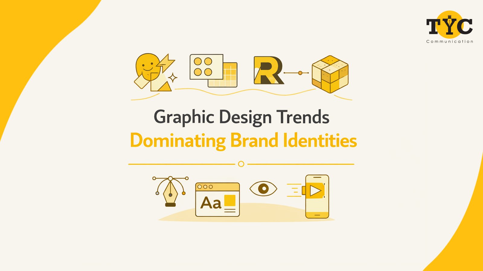
Graphic Design Trends Dominating Brand Identities
tyccAd | April 21, 2026 | Public Relations,Branding,Search Engine Optimization,Digital PR,Social Media,Digital marketing services,media relations


Brand identity today extends beyond business cards. Companies need to establish complete brand experiences. The brands succeed at their current level only when they or their design agency use unconventional methods to operate.
The design world is currently experiencing a shift which has a greater impact than most brands realise. Here’s what The Yellow Coin Communication has observed with its clients.
For years, everyone preached the gospel of minimalism. The design process requires the use of clean lines, which should be combined with white space and one chosen sans-serif font. The design maintains its original function, but now people want to see more. The design displays multiple bold colours, which designers use to build their visual display. The design uses typography which produces an extremely loud sound that reaches all parts of the display. The design uses multiple textures, which create visual conflicts between different patterns and elements that appear to move. The brands Jacquemus and Duolingo use visual disorder in their designs, which people find attractive because it appears to be intentional.
Fonts which resemble 1970s supermarket flyers and vintage diner colour palettes create a familiar feeling which most people find comforting. The current design trend uses grainy textures and muted earth tones together with distressed type and hand-drawn elements to create a human touch that exists within a digital environment. Brands use retro aesthetics to create immediate emotional ties with their customers because they have no other creative solutions. You feel something when you see it.
Static logos are starting to feel a little still. Brands are using animated identity systems which combine logos that change their appearance, shifting colours and moving mascots. The system functions as a logo which possesses character traits. The ability of your brand to display movement creates additional storytelling possibilities, which work effectively on social media platforms and in short video content because users can only focus on content for brief periods.
Current popular brand identities use design elements that create an appearance of being intentionally flawed through their mismatched textual alignment, their use of brutalist design and their display of unrefined MS Paint style. The artwork creates a strong emotional reaction from people who view it, creating an impression which remains within the minds of its viewers. Brands use this strategy to appeal to young consumers who understand cultural trends because it shows their relaxed dedication to marketing.
Typography has quietly become the loudest thing in the room. Brands are using type as illustration through words, which can stretch, compress and flow through liquid movement. Variable fonts enable designers to create diverse typography through one typeface, which offers multiple weights and widths. The font becomes the brand when it is properly executed.
Trends exist for a reason. They reflect what people are responding to right now. But blindly following them without considering your brand’s actual personality is a fast track to looking like everyone else. The best design agency understands that the most successful brand identities borrow from trends without being owned by them.
The question at this juncture is not what the Internet is buzzing about, but rather what feeling you would like to create while designing a certain product. The Yellow Coin Communication is among the top designing and branding agencies which help clients create designs that maintain their unique identity while achieving a strong market impact. Contact us today to get started.
Uppal Plaza, M6, Suit - 3B, 3rd Floor, District Centre,
Jasola, New Delhi – 110025